Thursday 18 April 2013
Sunday 7 April 2013
Evaluation
1. In what ways does your media product use, develop or challenge forms and conventions of real music products?

 For my music video, I chose a song named 'cousins' sung by the well known band Vampire Weekend, a band formed in New York City and that specialises in the genre's of indie rock, indie pop, synthpop and world beat themed music. This band I had chosen is not mainstream which I liked as the music was different and it's aimed audience was more niche ( usually the younger generation and indie/rock influenced people). The original music video which I found on the social networking site Youtube.com was very different to my ideas as the original relied very much on the performance of the band where as I wanted mine to be more narrative related. Music videos that inspired me with my ideas included the A team performed by Ed Sheeran and Rooftops by Lost prophets. I believe these two music videos had the most influence on my finished product as elements from both of these videos I believe helped my to show the message I was trying to put across to my target audience which included youth culture and the occurring problems in society such as drug problems, homelessness and the friction between generations.
 My ideas after these essential codes and conventions I began to create an idea of what I wanted my narrative to be. My chosen narrative included a young girl that decided to rebel from her middle class family as she felt to much under pressure to succeed in college from her pushy mother. In result of this the girl rebels and takes up a life of drugs and smoking to take away her troubles. From ideas taken from "I am the Walrus" by The Beatles showing drug influenced acts as the music video didn't take much sense I decided to use certain aspects to make the drug taking look believable such as hallucination, changes in mood and increase of energy which the ectasy drug apparently increases shown also by my independent research.
 Every part of my music video was very much planned including the use of clothing of my actress as I felt this also followed the codes and conventions of the indie/rock genre. I felt showing the current fashion trend in alternative clothing was very important as it once again aimed to attract my audience as it shows the similarities between the listener and created character. The main clothing ideas included a vintage over sized jumper, the make up choice and the hair style. From my research on the Internet it has been proven by social psychology experts that women who wear red lipstick are more outgoing, willing and also show a more sexual receptiveness which makes the person more attractive and eye catching which I defiantly wanted my actress to be.Many of the young generation today wear red lipstick although some people would argue it's 'trashy' while others see it as glamorous. The darkness of her eye make I felt was also important as commonly is shown to be expressive of a persons personality as it draws contact to the face. Lastly dark eyes are also very popular within fashion and alternative music. Therefore I believe the style of my actress follows the codes and conventions of the indie/rock genre.
For the mise en scene of film I chose various different locations with a vast amount of space to create a variety of different shots. These places included a park in Hessle, Hessle Square Hull City Centre, Queens Gardens and Ellie's house. I believe these locations I picked were perfect for my narrative as it showed the contrast between her life style as at home she was shown to innocent and in various other locations she was be shown to be care free and daring. However I did find it difficult to get to certain locations as there was a short distance needed and sometimes money needed for bus fare so therefore it made it difficult to re shoot. Overall, I filmed all my footage over 4 separate occasions, from the 28th November 2012 to 24th February 2013, accumulating over 2 hours of footage.
As I wanted to illustrate fun, reckless and care free life of a typical teenager involved in drugs with indie/rock interests I felt the activities I made Ellie take part in were very relevant to the state of mind I wanted to show to be in from taking drugs. The part I found difficult with creating a range of different things was to
not repeat shots a lot which was hard as all shots were fast paced and short.
Another convention of indie/rock music videos, or music video in general is for the content to be edited closely to the pace of the music. The reason behind this is to ensure that the content of the video follows the song effectively so therefore I made this occur in my music video as much as I possibly could when creating it on the edit suite. Following this idea I made sure that all my shorts were fairly short as I didn't want to bore my target audience as no performance themes were used. Following this I decided I didn't want all my shots to be perfectly filmed as through certain clips being slightly out of focus,shaky or slightly askew I wanted to again illustrate the careless ideology of certain teenagers through the roughness of some of the clips I used.
Additionally, I felt it was very important to have varied camera shots to keep the audience interested and entertained. Shots I used included. low angles, close ups and extreme close ups to illustrate the constant drama being shown in my narrative.
2. How effective is the combination of your main product and ancillary texts?
To create the best ancillary texts possible I firstly took many images when filming to make sure I got the perfect images for my digi pack and promotion poster and to also ensure continuity. I made sure I used numerous different camera angles and poses so I had a lot to experiment with including Ellie holding a lighter, images outside of her laughing and close ups of her face. When I decided on a couple of possibilities for my ancillary texts I began to edit the images using Adobe Photoshop CS5 which I have used a couple of times before creating a music magazine in my first year of college.
The picture I decided to chose for my front cover of my digi pack I chose was an image of Ellie mid shot holding a flame against I slightly plain background. I liked this image as although slightly plain I believe it draws attention to her face and dark red hair as she also had the flame of the lighter near her face. From the flame in her hand I felt this connected to the music video as a shot of this was actually shown along with it con notating a slightly rebellious side.

AFTER

I then began experimenting with different text styles for my digi pack as well as experimenting with different artist names. Before settling on the name of Young Lions before this I was compensating using War Kids. I decided not to use this name as I felt it was to serious sounding in contrast to young lions which sounded more lively like and fun. After placing the name of the band and the title of the album "bitter world" I felt this was enough for my front cover as it drew more attention to the image which I created with different tools to it look artistic along with drawing attention to the name of the band which is another convention of front covers.

 What have you learnt from your audience feedback?
Questions Provided For Feedback
What do you
think the video is trying to portray?
What do you
like about the video?
What could
be improved?
Do you
think the ancillary texts connect to the music video?
Would you
change anything about the ancillary texts?
From my audience feedback from a random selection of students in my college ( the same target range as my target audience) I now feel my music video and ancillary texts was mainly successful as most feedback was positive with not many criticisms although I encouraged my chosen few to pick out my products faults.
My first interview with Jennifer Brighton shared her own opinion on my products. Feedback which she gave me included that it's easily shown that my products are of the indie/rock genre as the natural of the video is rebellious and the style of my actress was also very stereotypical of an 'indie' looking girl.She also progressed on too say all products have good continuity and she also loved the variety of shots which I placed in the video. From this feedback from Jennifer I'm really happy with my products as it's portrayed all I wanted it too including the rebellious nature and the problems with drug taking.
My second interview with Rachel also went well as her feedback was fairly positive. The aspect that I love that Rachel mentioned was that she realised that my character and her mother don't have a good relationship from pressure of doing well in school and that she's trying to be her own individual as she's getting older. I'm really happy that this idea is shown easily in the music video as I wanted to show some problems in teenage life today.
For my third interview I decided to interview former student Daniel I received similar feedback to Rachel as he also felt that the video was portraying freedom and also liked the passe of the shots as they sped up and slowed down at points. He again had no negatives to give me. I believe it was very important to get feedback from a male as well as females as I wanted my products to target both genders.
The next person I interviewed was Ruby also realised the music video was focusing on today's problems and liked the video as it had jump cuts although the felt not all lip syncing was correctly in time which I do agree with.
Lastly I interviewed Aime, her comments included she felt that my choice of performer was perfect for my role as she fits the indie genre very well and she also said she liked the shots I have used epically the shot of Ellie spinning and showing her point of view looking up at the sky.
All people I interviewed also agreed that both my digi pack and promotion poster go well with my music video as they all have continuity as Ellie is wearing the same clothes as in the video and background colours are also similar.
From my feedback I'm very happy with my final product as I've put a lot of effort into it to make it look as professional as possible and to portray the issues of today.
How did you use new media technologies in the construction and research planning and evaluation stages?
Their are three main different media technologies which I used to create my ancillary texts, music video and to air them on the Internet and show my progress in planning. Adobe Premierpro CS6 was the main component to creating my music video which took a while to adjust too as it was my second time using it. I felt this programme which I used only in college was very beneficial to make my music video looks as professional as possible. After uploading my footage and re naming all of it separately this programme allowed me quickly and efficiently to cut and re-size clips, add special effects, increase/decrease the speed of clips and adjust the volume etc. The main effects I used on this programme including speeding up and slowing down clips alongside re-sizing and cutting. I felt that being able to speed up my clips really helped with making it match the beat of the music and made it look more effective then leaving shots dragging on which could of made it look slightly plain and boring. As I had a lot of footage in different locations doing different activities I really believe this helped me the most to follow the codes and conventions of the rock/indie genre. Although I could only access this programme in college I found it the most useful as it enabled me to do things with my footage that I never thought it'd be able to do and result I believe my music video has really benefited from it. The only problem with using this programme was the accessibility as students had to share each editing suite which sometimes made it difficult to use when you wanted too.I really do believe that when we first started the course the task to reconstruct 30 seconds of a music video which was Lana Del Ray 'Summer Time Sadness' in groups was really benefical in both filming and editing as I got a taster of what I was going to be using. Before using this programme for the second time I also used my own camera to film all my footage ( as I'd be able to access it whenever I wished) instead of lending a camera from the media department as they were on high demand. As I've had my camera for a fair few years I didn't have any problems with getting to grip with the settings which I felt saved time. Although not borrowing a camera I however did borrow a tripod which were on less demand as the college owned more, with the tripod it did take some getting used to as it was my first time using one but I did feel it was essential to use one as I wanted most shots to be steady hand.After creating my music video and exporting it from this programme I then progressed to post all my footage on Youtube including drafts, test shots with my camera and my final piece. With the use of Youtube I was then able to place it onto my blogger. I then used photoshop to help me improve my ancillary texts which I found very useful as I've used it before in my AS work. On the photoshop programme I used many different affects such as adjusting the colour and contrast of my images alongside lowering the opacity of certain things to make my actress stand out. On the poster I created I was also able to use the clone tool to re create the top of her head as it was cut off in the image, although this was time consuming I believe it paid off. The text I decided to use for my ancillaries I think worked well with my genre as it was bold, short and easily read. Lastly for the filming of my feedback I used my own Iphone 4 as I felt it was easy to use and to place on Youtube as it only took a couple of seconds.

 For my music video, I chose a song named 'cousins' sung by the well known band Vampire Weekend, a band formed in New York City and that specialises in the genre's of indie rock, indie pop, synthpop and world beat themed music. This band I had chosen is not mainstream which I liked as the music was different and it's aimed audience was more niche ( usually the younger generation and indie/rock influenced people). The original music video which I found on the social networking site Youtube.com was very different to my ideas as the original relied very much on the performance of the band where as I wanted mine to be more narrative related. Music videos that inspired me with my ideas included the A team performed by Ed Sheeran and Rooftops by Lost prophets. I believe these two music videos had the most influence on my finished product as elements from both of these videos I believe helped my to show the message I was trying to put across to my target audience which included youth culture and the occurring problems in society such as drug problems, homelessness and the friction between generations.
With all these ideas I wanted to inc-operate into my music video I felt the passe of the song ( up beat and fast) fitted nicely with the short passed shots I wanted to create. Because of the up beat tempo I believe this follows codes and conventions of indie rock as it's very recognisable of this genre as it's popular with the younger generation. I planned to create a narrative based video with elements of continuity as my main aim was to make it look realistic and professional as possible. I also chose narrative as my main performer who I believed to be perfect for my ideas was a young women Ellie and the performer in the original music video was a man so therefore performance I believe would of looked inconceivable as they are different genders although I did decide in the end I could place a little performance in the video like Ellie's singing along to the song. As many music videos want to show the artist performing to promote themselves my aim was more to represent something significant to my target audience of young people which seems relevant to them. Lastly I also decided mainly on a narrative themed video as I felt it would put my creative side to good use as I think performance is quiet limited when it comes to certain shots however I still think it fits the codes and conventions of indie rock as both influences where narrative related.
Another popular code and convention of music videos of the indie/rock genre was to express ' real life' situations which i aimed to relate to it's audience, therefore I felt this was very important to place into my video as it gives the audience a sense of understanding of what the artist's beliefs are. An example of this in an existing music video is shown in the the A team music video by Ed Sheeran as a young woman plays a homeless prostitute in an all narrative video showing the consequences of drug addiction. I love the idea of portraying a real life situations as the it gives the song a meaning and doesn't sugar coat the truth of the negatives in society and most importantly promotes awareness. Because of these reasons and being a teenager myself I believed it would be essential to portray the freedom of the teenage generation and sometimes the recklessness of teen spirit from pressures such as family life.
 My ideas after these essential codes and conventions I began to create an idea of what I wanted my narrative to be. My chosen narrative included a young girl that decided to rebel from her middle class family as she felt to much under pressure to succeed in college from her pushy mother. In result of this the girl rebels and takes up a life of drugs and smoking to take away her troubles. From ideas taken from "I am the Walrus" by The Beatles showing drug influenced acts as the music video didn't take much sense I decided to use certain aspects to make the drug taking look believable such as hallucination, changes in mood and increase of energy which the ectasy drug apparently increases shown also by my independent research.
  Every part of my music video was very much planned including the use of clothing of my actress as I felt this also followed the codes and conventions of the indie/rock genre. I felt showing the current fashion trend in alternative clothing was very important as it once again aimed to attract my audience as it shows the similarities between the listener and created character. The main clothing ideas included a vintage over sized jumper, the make up choice and the hair style. From my research on the Internet it has been proven by social psychology experts that women who wear red lipstick are more outgoing, willing and also show a more sexual receptiveness which makes the person more attractive and eye catching which I defiantly wanted my actress to be.Many of the young generation today wear red lipstick although some people would argue it's 'trashy' while others see it as glamorous. The darkness of her eye make I felt was also important as commonly is shown to be expressive of a persons personality as it draws contact to the face. Lastly dark eyes are also very popular within fashion and alternative music. Therefore I believe the style of my actress follows the codes and conventions of the indie/rock genre.
 For the mise en scene of film I chose various different locations with a vast amount of space to create a variety of different shots. These places included a park in Hessle, Hessle Square Hull City Centre, Queens Gardens and Ellie's house. I believe these locations I picked were perfect for my narrative as it showed the contrast between her life style as at home she was shown to innocent and in various other locations she was be shown to be care free and daring. However I did find it difficult to get to certain locations as there was a short distance needed and sometimes money needed for bus fare so therefore it made it difficult to re shoot. Overall, I filmed all my footage over 4 separate occasions, from the 28th November 2012 to 24th February 2013, accumulating over 2 hours of footage.
As I wanted to illustrate fun, reckless and care free life of a typical teenager involved in drugs with indie/rock interests I felt the activities I made Ellie take part in were very relevant to the state of mind I wanted to show to be in from taking drugs. The part I found difficult with creating a range of different things was to
not repeat shots a lot which was hard as all shots were fast paced and short.
Another convention of indie/rock music videos, or music video in general is for the content to be edited closely to the pace of the music. The reason behind this is to ensure that the content of the video follows the song effectively so therefore I made this occur in my music video as much as I possibly could when creating it on the edit suite. Following this idea I made sure that all my shorts were fairly short as I didn't want to bore my target audience as no performance themes were used. Following this I decided I didn't want all my shots to be perfectly filmed as through certain clips being slightly out of focus,shaky or slightly askew I wanted to again illustrate the careless ideology of certain teenagers through the roughness of some of the clips I used.
Additionally, I felt it was very important to have varied camera shots to keep the audience interested and entertained. Shots I used included. low angles, close ups and extreme close ups to illustrate the constant drama being shown in my narrative.
2. How effective is the combination of your main product and ancillary texts?
To create the best ancillary texts possible I firstly took many images when filming to make sure I got the perfect images for my digi pack and promotion poster and to also ensure continuity. I made sure I used numerous different camera angles and poses so I had a lot to experiment with including Ellie holding a lighter, images outside of her laughing and close ups of her face. When I decided on a couple of possibilities for my ancillary texts I began to edit the images using Adobe Photoshop CS5 which I have used a couple of times before creating a music magazine in my first year of college.
The picture I decided to chose for my front cover of my digi pack I chose was an image of Ellie mid shot holding a flame against I slightly plain background. I liked this image as although slightly plain I believe it draws attention to her face and dark red hair as she also had the flame of the lighter near her face. From the flame in her hand I felt this connected to the music video as a shot of this was actually shown along with it con notating a slightly rebellious side.
BEFORE

AFTER

I then began experimenting with different text styles for my digi pack as well as experimenting with different artist names. Before settling on the name of Young Lions before this I was compensating using War Kids. I decided not to use this name as I felt it was to serious sounding in contrast to young lions which sounded more lively like and fun. After placing the name of the band and the title of the album "bitter world" I felt this was enough for my front cover as it drew more attention to the image which I created with different tools to it look artistic along with drawing attention to the name of the band which is another convention of front covers.
On the back of the album cover I felt that the colors had to be similar to the front cover as it followed the continuity codes and conventions to make sure it had professorial finish along with the little extras such as the bar code and the copy right legislation. On the inside of the digi pack I decided again to use a similar image for were the CD would be placed as I felt this image I had taken was very powerful in what I wanted to express. For the left and right panel I decided to place trees on both at a low opacity as I felt it carried on with the artistic feel and also connected to my video as trees were involved.
To carry on the continuity between the ancillary texts I decided to choose the same image that I used for my digi pack as I feel it's very eye catching. Using the same image however did create some difficulties has the top of Ellie's head needed to be recreated which I carefully did using the clone tool. To make the poster look realistic I decided to place ratings from created sounding indie magazine as I believe advertising the album is very important. As a little extra I also decided to place an Itunes logo at the bottom of the poster as the logo is well known on popular music posters.
The thing I found most difficult creating the ancillary texts was to ensure all the images linked perfectly together on each panel of my digi pack and my poster. Overall I felt my use of colours are very effective as they're all quite natural colours such as the greens and the greys which I believe connect to the music video as she's mainly outside and it also represents freedom. The choice of these colours I also believe made my actress stand out more as the only unnatural colours are on her face with her red lipstick and her dyed red hair, I think this draws attention to her and it's showing that she has a big personality.
The thing I found most difficult creating the ancillary texts was to ensure all the images linked perfectly together on each panel of my digi pack and my poster. Overall I felt my use of colours are very effective as they're all quite natural colours such as the greens and the greys which I believe connect to the music video as she's mainly outside and it also represents freedom. The choice of these colours I also believe made my actress stand out more as the only unnatural colours are on her face with her red lipstick and her dyed red hair, I think this draws attention to her and it's showing that she has a big personality.
Questions Provided For Feedback
-Do you
think my music video and ancillary texts fit the conventions of indie rock?
(These questions I have created I felt answered all the areas that are important for my created media products.)
From my audience feedback from a random selection of students in my college ( the same target range as my target audience) I now feel my music video and ancillary texts was mainly successful as most feedback was positive with not many criticisms although I encouraged my chosen few to pick out my products faults.
My first interview with Jennifer Brighton shared her own opinion on my products. Feedback which she gave me included that it's easily shown that my products are of the indie/rock genre as the natural of the video is rebellious and the style of my actress was also very stereotypical of an 'indie' looking girl.She also progressed on too say all products have good continuity and she also loved the variety of shots which I placed in the video. From this feedback from Jennifer I'm really happy with my products as it's portrayed all I wanted it too including the rebellious nature and the problems with drug taking.
My second interview with Rachel also went well as her feedback was fairly positive. The aspect that I love that Rachel mentioned was that she realised that my character and her mother don't have a good relationship from pressure of doing well in school and that she's trying to be her own individual as she's getting older. I'm really happy that this idea is shown easily in the music video as I wanted to show some problems in teenage life today.
For my third interview I decided to interview former student Daniel I received similar feedback to Rachel as he also felt that the video was portraying freedom and also liked the passe of the shots as they sped up and slowed down at points. He again had no negatives to give me. I believe it was very important to get feedback from a male as well as females as I wanted my products to target both genders.
The next person I interviewed was Ruby also realised the music video was focusing on today's problems and liked the video as it had jump cuts although the felt not all lip syncing was correctly in time which I do agree with.
Lastly I interviewed Aime, her comments included she felt that my choice of performer was perfect for my role as she fits the indie genre very well and she also said she liked the shots I have used epically the shot of Ellie spinning and showing her point of view looking up at the sky.
All people I interviewed also agreed that both my digi pack and promotion poster go well with my music video as they all have continuity as Ellie is wearing the same clothes as in the video and background colours are also similar.
From my feedback I'm very happy with my final product as I've put a lot of effort into it to make it look as professional as possible and to portray the issues of today.
How did you use new media technologies in the construction and research planning and evaluation stages?
Their are three main different media technologies which I used to create my ancillary texts, music video and to air them on the Internet and show my progress in planning. Adobe Premierpro CS6 was the main component to creating my music video which took a while to adjust too as it was my second time using it. I felt this programme which I used only in college was very beneficial to make my music video looks as professional as possible. After uploading my footage and re naming all of it separately this programme allowed me quickly and efficiently to cut and re-size clips, add special effects, increase/decrease the speed of clips and adjust the volume etc. The main effects I used on this programme including speeding up and slowing down clips alongside re-sizing and cutting. I felt that being able to speed up my clips really helped with making it match the beat of the music and made it look more effective then leaving shots dragging on which could of made it look slightly plain and boring. As I had a lot of footage in different locations doing different activities I really believe this helped me the most to follow the codes and conventions of the rock/indie genre. Although I could only access this programme in college I found it the most useful as it enabled me to do things with my footage that I never thought it'd be able to do and result I believe my music video has really benefited from it. The only problem with using this programme was the accessibility as students had to share each editing suite which sometimes made it difficult to use when you wanted too.I really do believe that when we first started the course the task to reconstruct 30 seconds of a music video which was Lana Del Ray 'Summer Time Sadness' in groups was really benefical in both filming and editing as I got a taster of what I was going to be using. Before using this programme for the second time I also used my own camera to film all my footage ( as I'd be able to access it whenever I wished) instead of lending a camera from the media department as they were on high demand. As I've had my camera for a fair few years I didn't have any problems with getting to grip with the settings which I felt saved time. Although not borrowing a camera I however did borrow a tripod which were on less demand as the college owned more, with the tripod it did take some getting used to as it was my first time using one but I did feel it was essential to use one as I wanted most shots to be steady hand.After creating my music video and exporting it from this programme I then progressed to post all my footage on Youtube including drafts, test shots with my camera and my final piece. With the use of Youtube I was then able to place it onto my blogger. I then used photoshop to help me improve my ancillary texts which I found very useful as I've used it before in my AS work. On the photoshop programme I used many different affects such as adjusting the colour and contrast of my images alongside lowering the opacity of certain things to make my actress stand out. On the poster I created I was also able to use the clone tool to re create the top of her head as it was cut off in the image, although this was time consuming I believe it paid off. The text I decided to use for my ancillaries I think worked well with my genre as it was bold, short and easily read. Lastly for the filming of my feedback I used my own Iphone 4 as I felt it was easy to use and to place on Youtube as it only took a couple of seconds.
Sunday 24 March 2013
Editing and filming log sheet

Friday 22 March 2013


Thursday 21 March 2013
My finished digi pack
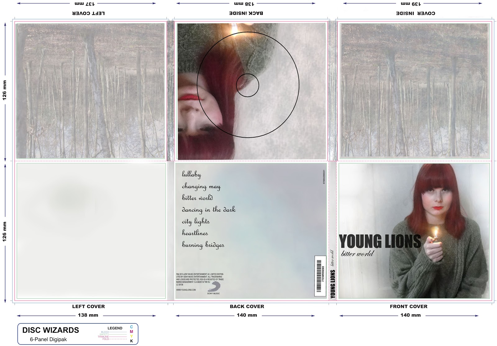
This is my finished digi pack which I created from scratch on photoshop. This design took me a long time to complete as all images have been taken and manipulated by me. I was aiming for a proffesional and clear finish with good quality photo's and I believe I have achieved this. I like the images I have chosen as they're very eye catching espically the front cover image as I've made Ellies hair more vibrant and changed the opacity of her to make it look more atistic. On this image I have also changed the background as it was againt a door, it now just looks more plain which I wanted to do to make my artist stand out more. I also like the use of the lighter in her hand as their is also a shot of her in the video holding a lighter alongside wearing the same clothes. This was important as I wanted my digi pack to be easily recognized as it has mainly simalirites to my music video. The house style I have chosen for my digi back I believe suits well as it makes my artist the centre of attention espically with the vibrant colour of her hair. The trees I have used for the inner covers I think suit well as trees are also shown in the video. I believe it's very important to have similarities between all my word to show that they're all conneceted which I think makes it look more realistic and proffesional. Overall I'm very pleased with my digi pack design as I really thought about the little details to make it look interesting.
Wednesday 13 March 2013
Choices for my front cover

From all the photo's I have taken of my artist I've decided it will be one of these which I choose from my font cover. Although they're only slightly different my aim is to make my digi pack look as professional as possible.
In the first image I have placed trees from the music video behind her making them a low opacity so they can be seen through the white background. I like this image as it looks like a lot of time has been spent on it and looks slightly ghost like.

The second image I like as although its far more plain I think it draws far more attention to her, which is good as she's the main image. I also slightly think it looks more realistic as it's not cluttered.
Subscribe to:
Posts (Atom)